graphic designer | illustrator


Clients loved direction C but wanted to see it in a container of the classic retro motel key chain shape.
We also wanted to create some flexibility and fun in the branding and have logo versions that weren't in the container, and could be used in more of a vertical layout. Logo versions for social, animations, and illustrations use were also created.

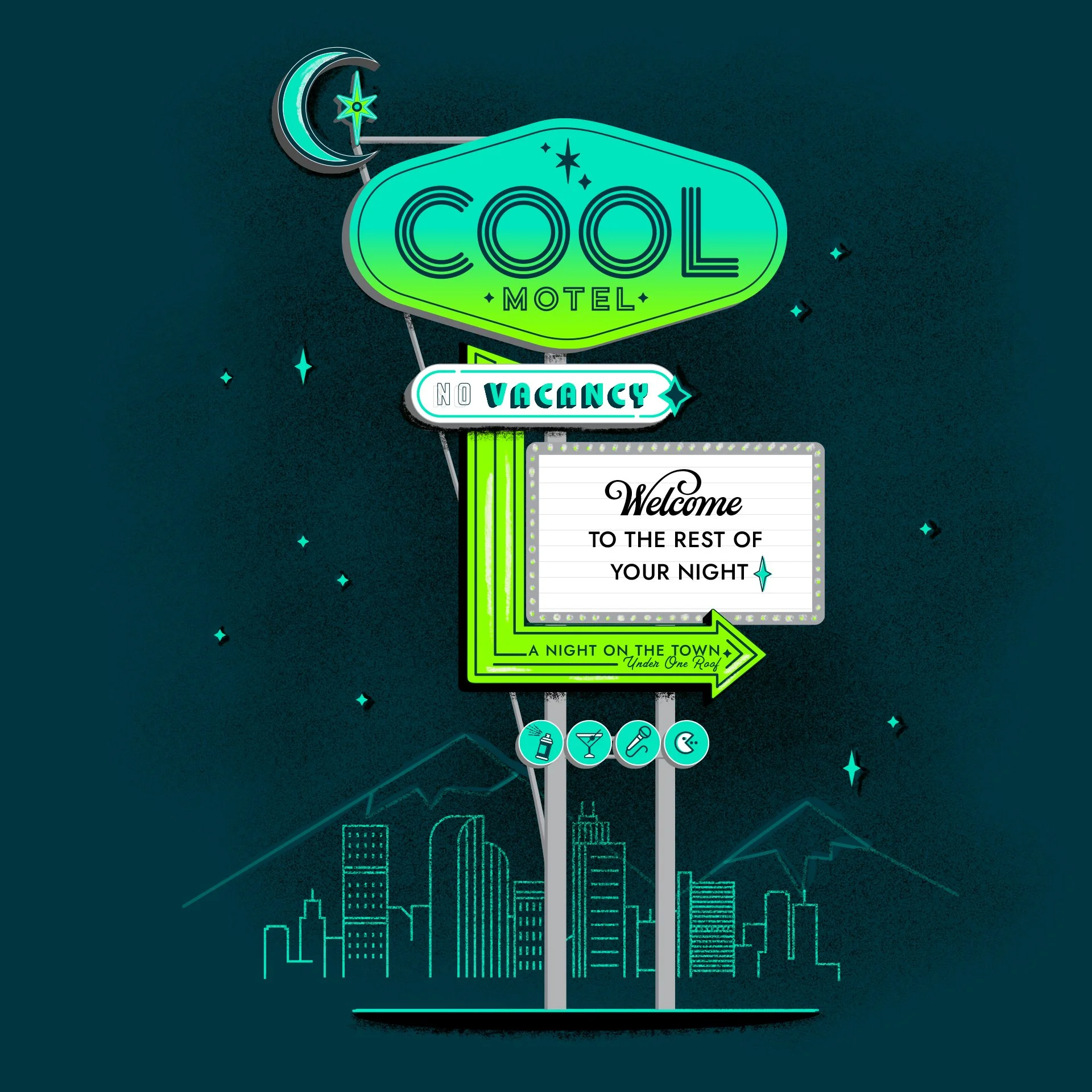

Additional brand type elements created.


